EVO and Company is now Salt Athletic. After an initial run at Kickstarter, the founders of EVO came back to me to refine and redevelop their brand. I introduced them to and worked with them via a small studio and we have created an amazing new brand for them. Take a look at a small studio's case study to see some of the latest work I've done with Salt.
 a small studio
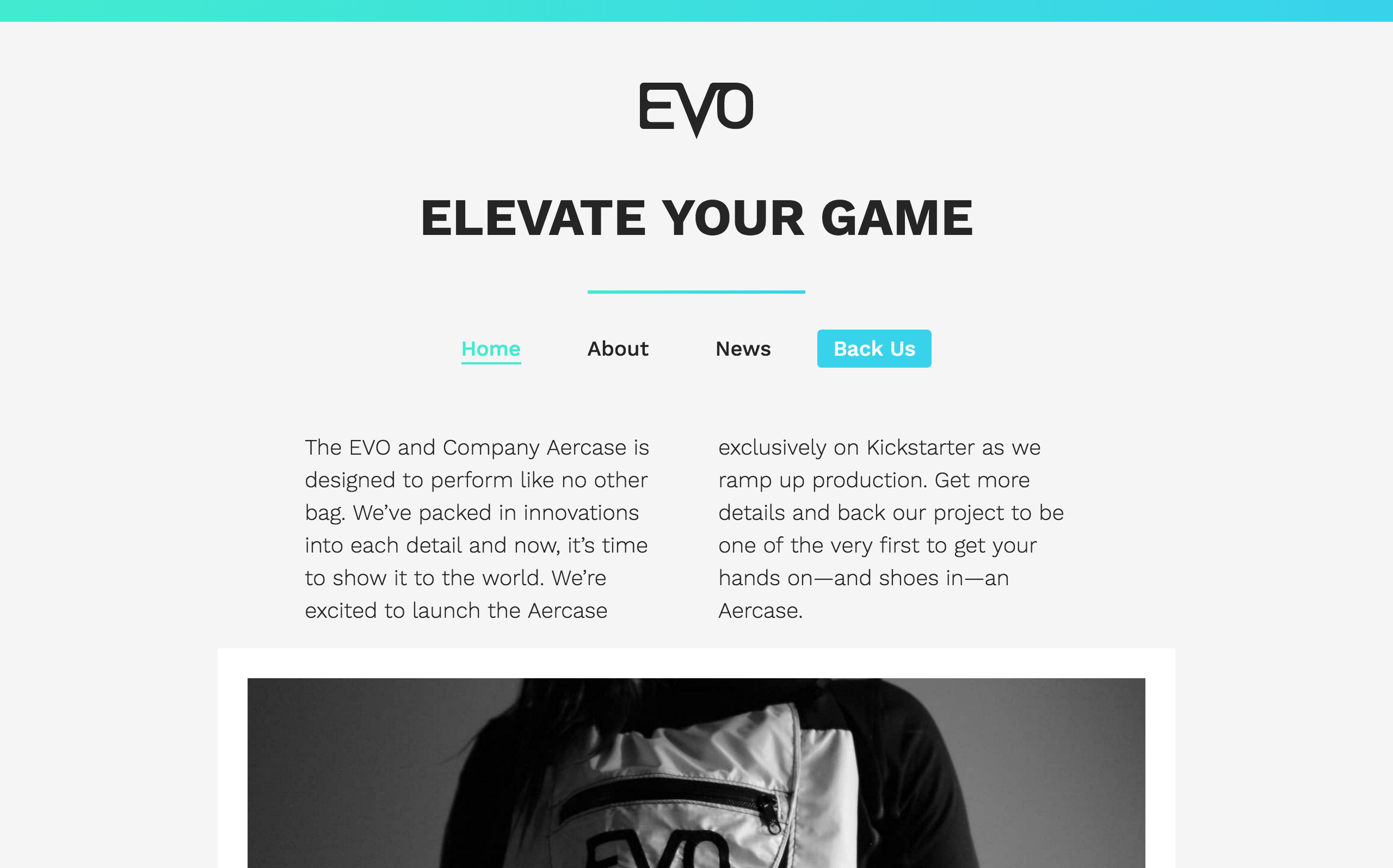
EVO and Company is a new brand for active people. Their first product, the Aercase, started on Kickstarter but is now accepting preorders.
I did the branding and website for EVO. The branding is modern and striking, designed to turn heads and not be hidden away on a label. The site is a WordPress theme designed from the ground-up to be flexible and lightweight and the basis of the company's online operations for years to come.
Website
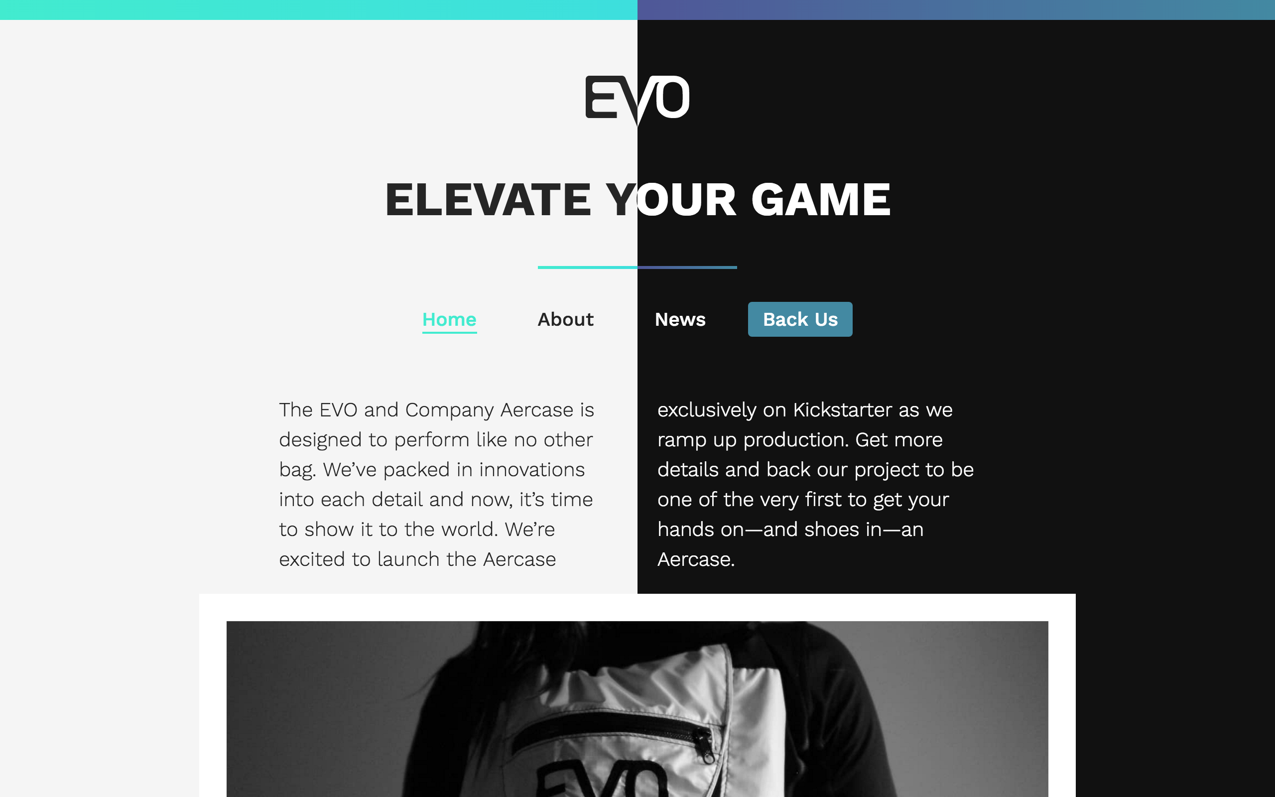
When beginning to work on the site, everything had a dark background with white text to form a sense of luxury and exclusivity. This worked for the front page and about pages which were light on content. When it came time to design the News page, I realized immediately that the white on dark colour scheme would not make for a good reading experience so I created a light theme and a system to switch between the light or dark theme depending on the current page. That led to a very disruptive experience when navigating between pages so I went light with the whole website. It just wouldn't be right to completely nix the dark theme, so I added an accessible toggle in the footer to enable dark mode and used Local Storage so the setting would persist between pages and visits. This allows the dark EVO theme to live on and provides a high-contrast experience for users that find it more comfortable.
Brand
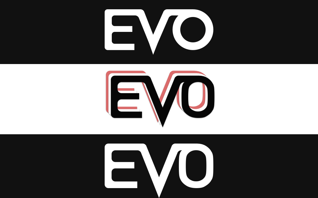
They needed a logo that appeared professional as well as bold and active in addition to a sense of luxury. Proper usage of the logo requires it to have plenty of breathing room and direct contrast with the background it is on. This is evident even in the Aercase's design. Early versions of the arcade sported a silvery textile but we switched to a solid black and white design to put the logo in stark contrast with the bag.
The letters have been carefully proportioned so that the emphasized 'V' stands out but remains in the center of the logo.